
Web Design, UX Design, Graphic Design, Branding
Brand and Website for The REMCO Group
Designing branding guidelines and a company website for a sustainability infrastructure start-up, increasing market exposure and brand credibility


Design Brief
The REMCO Group is an emerging sustainability start-up that invests with business and community leaders to develop clean energy infrastructure. They needed a website ASAP to express their mission of a net zero carbon future and detail their diverse expertise and value proposition. I built their website from the ground up, from branding, determining their corporate voice, to information architecture, user flow, and graphics.
Kickoff and Branding
Starting from ground zero
At the beginning of the project, the REMCO Group was an extremely new startup-up with an unclear identity and focus. To be able to properly represent the group’s mission and offerings in a website, I had to define what these were in the first place. After leading several discussions with the group’s founding members to help them pinpoint and clarify the REMCO Group’s target audience, strengths, and goals, we came to the following:
The REMCO Group Brand:
1. Renewable Energy, Sustainability
2. Expertise, Dependability, Strength
3. Technological Advancement, Innovative, Adaptive
Tagline: “Powering tomorrow's mobility with tomorrow’s energy.”

Visual Branding
Balancing authority and approachability
We wanted the visual language to be simple so that the text and information would be easily readable and understandable. I also needed to find the right balance between authority and approachability; this came through in the color choices and sans serif yet mature fonts. I also included simple, line-based icons to improve reader understandability while conveying approachability and elegance.
Color Scheme

Typography Scheme

Icons

Website UX
Website Wireframes
The goal of the website was to communicate The REMCO Group’s offerings and convey a sense of expertise and dependability. The target audience was businesses and municipal organizations.
Landing Page

The tagline and company mission near the top of the landing page immediately conveys REMCO’s value proposition and core values.
Compelling statistics about environmental issues as well as the financial benefits of transitioning to carbon neutrality helps appeal simultaneously to the environmentally-conscious and financially-focused target audiences.
What we do

Information is broken up into several sections under headers to improve readability and engagement. Icons are used to convey the REMCO’s offerings at a glance and enforce an savvy but approachable brand image.


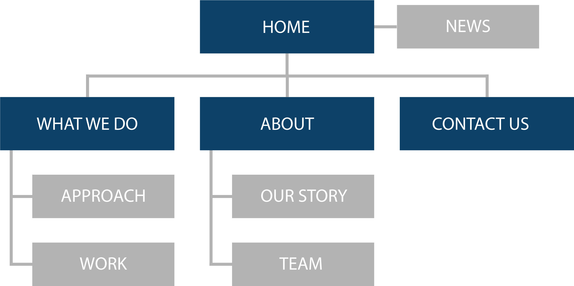
Website Site Map
Landing Page
A Powerful First Impression

Philadelphia
The landing page and hero image is the first chance for the client to get a sense of what The REMCO Group does and what it stands for. Because REMCO is based in Philadelphia and often works with clients in the Philadelphia and Pennsylvania areas, we chose an image of Philadelphia’s distinct skyline to create immediate recognition and rapport.
Nature and Industry
For the hero image, we chose a framing of the city that includes a display of industrial development and technology, as well as nature, greenery, and a river. This strikes a harmonious balance to visually communicate the brand values of sustainability and technological advancement.


